Elements
Basic controlsBasic controls - Lists
Overviews
Overviews - Tree controls
Filters
Additional controls for calendars
Images and files - Image controls
Images and files - File controls
Search and navigation
Programming
Intrexx Share
Other controls
Functions for the elements: Sortable list, File selection, View field with control type: Image-URL
Underneath the application structure you will find the Elements area.
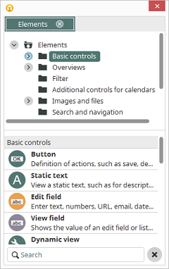
The elements that you will use to construct an application can be selected here and then moved onto the workspace via drag & drop.
 |
If you drag an existing element, or multiple elements, from the workspace to the Elements area, you can create an element template. The properties that have already been defined for the element(s) are saved in this template. |
The display of elements can be changed via the context menu.
- Show icons: shows the elements' icons
- Show icons and titles: shows the elements' icons and titles
- Show icons and descriptions: shows the elements' icons and descriptions
To create a new element, please select a page in the application structure. Depending on the type of page you selected, only the elements which can be used for the page will be available. Next, drag the element that you wish to create to the workspace. The borders of the element will be shown as a preview of the element. Next, an assistant will lead you through the creation process.
Basic controls
Button
Buttons execute numerous database actions, such as saving and deleting data records. If a jump target is entered, the button can load additional pages in a main or popup window or in tooltips. Buttons need not be shown in the browser as buttons: they may also take the form of text links or images. The button type will be set in the properties dialog on the General tab.Static text
This view element will show static text. This text, which can also contain HTML tags, will be set in the properties dialog on the General tab. As a further option, the element can also be used for programming to, for example, display dynamic content.Edit field
Edit fields can be used to enter data in various formats. The entry length is limited to 255 characters.View field
View fields will be used to display data. As with Edit field, various control types can be selected.Dynamic view
With this view control, you can show values that differ from the saved value.Text area
Multiple lines of text may be entered into text areas. The entry length is not limited. Text areas can only be connected to Text data fields. In editor mode, you can use a HTML editor for editing the text. The editor's symbol bar and buttons can be configured personally.View text area
The view element View text areawill display multiple lines of text.Radio button
The Radio Button consists of individual options combined in a group. Only one of the options may be selected by the user in the browser. The value of the selected option will be saved as text in the linked data field. Double-clicking on the group border of the Radio Button will open its properties dialog.Checkbox
Checkboxes save Boolean values. If a checkbox is marked, it will return the value Yes; if it is not selected, it will return the value No. This value will be entered to the connected Boolean data field when the data set is saved.View checkbox
With the Image setting, a checkbox view element will be shown in the browser as a checkbox. As with the button, images can be loaded to show selected or not selected status of the checkbox. A checkbox counts as selected when its connected data field returns the value Yes; with a value of No , the checkbox will be displayed in the browser as not selected.Slider
Dropdown lists can also be configured as sliders.Line
The Line element can be used to help structure a page.Grouping
Elements can be grouped together by using the grouping tool. Drag the grouping element onto the workspace and arrange the elements, which you would like to group, within it. Groupings can also be created using the context menu from highlighted elements. More information on this topic can be found here.Basic controls - Lists
Drop-down list
Drop-down lists will be used to display entries in list format.Listbox
The listbox offers the same functions as the Drop-down list (with the exception of data assignment), but shows the entries in the browser as an open list.Multiple selection
With the Multiple selection edit element, multiple values may be selected.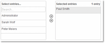
Here, you can see the edit page of an application in which customer-specific tasks are distributed to employees. In the multiple selection, all employees will be listed. In the Select entries... field, you can search for employees, and move them to the Selected entries list with a double click by clicking on the
 arrow button.
You can also select multiple entries in the Select entries... list by holding down the CTRL key and then move them with the
arrow key to the Selected entrieslist.
arrow button.
You can also select multiple entries in the Select entries... list by holding down the CTRL key and then move them with the
arrow key to the Selected entrieslist.
Furthermore, you have the option in the settings of the multiple selection to create a filter, depicted by images that you can select freely, which will be shown above the entries. Clicking on an image activates the filter and only shows the entries that apply for the set criteria.
The values that have been entered with a multiple selection can be shown with the view elements View multiple selection and View table.
|
To support a Contains filter for the search in the multiple selection, the setting control.distribution.list.searchContainMode=true needs to be defined. |
Users and groups
With this setting, the multiple selection will be used for the selection of users, user groups, and additional objects from the Intrexx User Manager.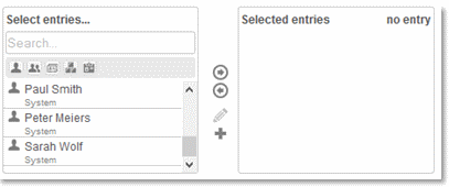
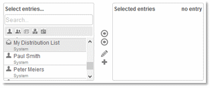
In the search field, you can search for the object name from the user manager. Filter buttons are located underneath this field, with these buttons the filter for the search can be restricted or expanded for users, user groups, distribution lists, organizational units and roles, depending on whether the corresponding button is activated or deactivated.
By a double-clicking, the objects that are intended for the distribution list will be added to the Selected entries field. Upon saving the data set, the GUIDs of the objects will be entered to the connected text data field. By clicking
 Create new distribution list, new distribution lists can be defined.
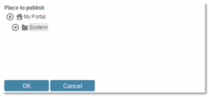
The structure of the User Manager will be shown here. Select the Place to publish and click on OK.
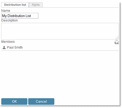
Enter a name for the new distribution list. A description may be entered here as well. By clicking
 Add Members, objects from the User Manager will be added as recipients to the distribution list.
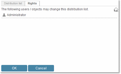
On the Permissions tab, you will define which users and/or objects from the User Manager will be allowed to change the recently created distribution list. You can define permission holders by clicking on
Add Members here as well. Click on OK to save the settings.
The distribution list has now been added in the browser, as well as in the User Manager. With
 Edit distribution list, all existing distribution lists can be edited.
The distribution list can then be implemented into the email configuration of a button. When this button is clicked, each member of the distribution list will then receive the email. The list can also be used in filters.
View multiple selection
The View multiple selection shows values from fields of the data type text or from subordinate data groups.Sortable list / View sortable list
The order of entries in the sortable list can be changed however you wish in the end device via drag & drop.Overviews
View table
With a view table, data records will be displayed in table format. For each connected data field, a table column will be created, and for each data record, a row in the table will be created. The sorting of the table can be changed in the browser by clicking on the column header. A view table can display data of the same level, data from superordinate data groups and data from the immediately subordinate data group.Free layout table
In the Free layout table, a view page will be integrated, which will be retrieved to display the existing data records. The view page can be structured to a great extent with pictures, headings and texts that are formatted as desired. Tables cannot be used on view pages that are displayed in a free layout table.Calendar and resource
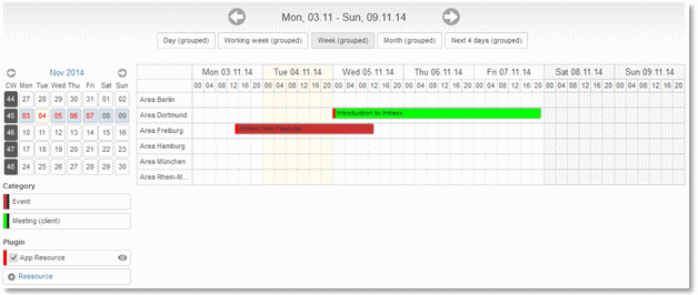
The Calendar and Resource controls can be inserted into an application of your choice. The control can be used either as a calendar or as a resource chart - the difference between those two controls are the presets that can be set for the different presentations of the data.Calendar view
Resource view
Overviews - Tree controls
Tree / View tree
Hierarchical structures will be displayed with the tree element.Exchange tree
These control can exclusively be used in Exchange applications.Path navigation for tree
You have the option to setup a path navigation for both edit and view elements for the tree. In this way, you can navigate through its structure using either the tree control or by entering the path.Filters
Filter information
The Filter information shows the current value from the selected controls on the same page at runtime, and offers the facility to reset these values. All of the elements, that are used in a dependency and the settings of which are displayed, can be assigned. This enables the user to have a much clearer view of which filters are currently applied.Value range
With the filter type Value range, the lower and upper limits of an area can be defined. The filter will be used for the types Date, Date & Time, Integer, Currency, and Floating-point. It consists of two edit fields, in which the lower and upper values can be entered. This allows, for example, for tasks to be filtered that began in a specific time frame. Here you can see both edit fields of the filter in the browser and underneath the view table that is connected with the filter.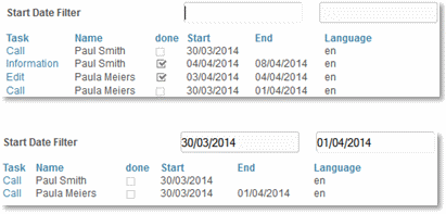
Value selection (drop-down list)
With the Value selection (drop-down list) filter, data records will be filtered by the selected entries. In this example, tasks have been filtered by priority (high, middle, or low).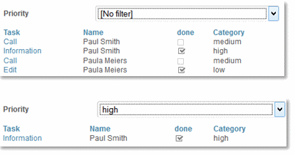
Value selection (open presentation)
With this filter, data sets will also be filtered according to the selected entries but in this case, a listbox will be used as the filter element instead of a drop-down list.Boolean values
The Boolean Values filter is specially designed for filtering checkboxes. With this filter type, you can, for example, filter by completed or incomplete tasks. Various other modes are available as well.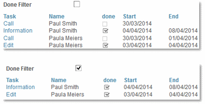
Operator
This filter control consists of three fields. In the first selection list of the filter, the data field will be selected, the values of which will be compared with the entered character string. Depending on the data type of the selected data field, various operators can be selected. In this example, the values of a data field have been compared with a search term. The operator selected in the middle filter list is definitive for the type of comparison.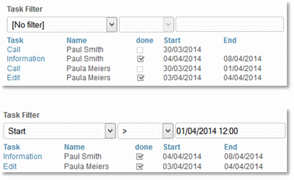
Alpha-index
With this filter type, data can be filtered via an index of letter and number groups.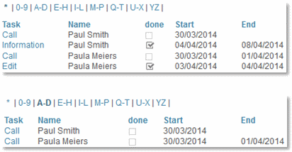
Options
In this example, the values in data fields will be filtered by the option that has been selected.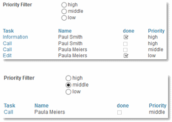
Checkbox selection
This filter allows you to define checkboxes, which can be given static values. Here, for example, tasks will be filtered by priority.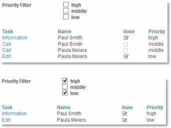
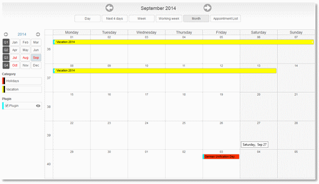
Calendar
With the calendar filter, data records will be filtered by the date that you conveniently select from the calendar control. In this example, tasks have been filtered by the date Start.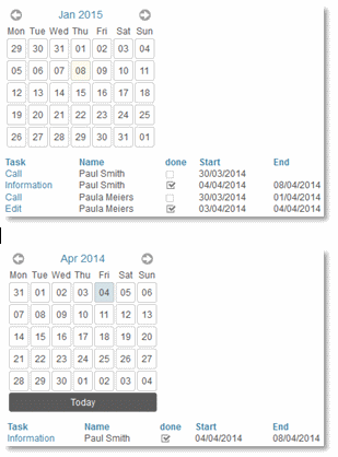
If you click with the right mouse button on the head of the small calendar, you can switch the control to the year view mode. In the year view, the filter can be set to quarters or months.
Additional controls for calendars
The additional controls for calendars can, aside from the appointment series, only be used if a calendar or resource element is located on the current page.Previous/Next
This additional control inserts two grouped button elements that enable navigation through the calendar. If multiple calendars or resource elements are located on the current page, a dialog opens when the Previous/Next element is created, allowing the control to be assigned to the desired calendar.View selection
This element allows you to switch the display of the calendar or resource element, such as from a daily to weekly or monthly view.Calendar
This additional control creates a small calendar that can help select a date in the chart for a calendar or resource element.Date display area
This element displays the title of the calendar when the corresponding calendar or resource element is entered in the Calendar drop-down list. The title is dynamically generated, depending on the view mode chosen by the user (such as November 2014 in the month view, or Monday, Sep. 29, 2014 in the day view).Recurring appointment
The Recurring appointment allows appointment series to be created.This element is used on edit pages.
Plugin selector
The plugin selector allows users to subscribe or unsubscribe to calendar plugins from other applications in the browser.Legend
Appointments can be categorized by users. The legend lists these categories with their corresponding background and font color.Selection of resources
With this additional control, you see a list of all resources in the browser that were created in a resource application. The resources can be unselected from this list if you, for example, want to reduce the complexity of your resource chart. New resources can also be chosen for display in the chart.Images and files - Image controls
Image
With the Image element, a static image of your choice can be saved on the server and displayed in the application. The element can also be used to prevent entries by bots.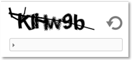
Gauge control
The Gauge control control is designed to show speeds, sound level, values of pressure, temperature or toner levels, and so on.Chart
This view element allows values of an application to be graphically displayed. The chart control provides many different templates, enables the number of data records to be limited, the integration of dependencies, the manipulation of all chart properties, and the ability to export charts as jpg, png, svg, and pdf.Gallery
With the gallery, you can integrate image galleries into your portal applications quite easily.Images and files - File controls
File selection
The File selection edit element gives you the ability to drag-and-drop files or to select them from directories in order to transfer them to the server, making them available for download there.View file selection
This view element shows the files that were uploaded using the File selection edit element.Exchange file selection for attachments
This control can exclusively be used in Exchange applications.File sorting
This element allows the order of files in the browser to be changed via drag-and-drop.Search and navigation
Search
In all Intrexx applications, you will find a main page with the title Search, on which you can search for terms within the application. In addition, other searches can be created with the help of the Search view element.Research
With the Research view element, complex queries about the data of an application can be made.FileWalker
The FileWalker view element can access files on the network. This requires a connection and sufficient rights to the network to function. The connection can be set up in the properties of the view element or in the Tools module.Navigation
This view element allows a user to page through existing data records. The navigation element will give the number of the current data record automatically upon loading the page. It consists of four individual buttons. The view and edit elements of the page on which the navigation element is positioned will be refreshed after each movement and then display the values of the data record to which it has moved.Relationships
With relationships, related information can be very easily and transparently displayed in the portal. In the Application Designer, the Relationships view element will be used in order to show the relevant data on an application page. You can drag it onto the workspace, just as with every other element, and position it there however you wish. Please note that the element can only be placed on pages underneath a data group.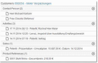
After saving the application, the element will be available. The page on which it is configured can, as in this example, be loaded in a tooltip via a button in a table, showing customer data. The view element here shows, to the right of the table, all data that is defined in the connected relationship diagram activities, contact persons, and external coordinators of the selected customer.
With the arrows to the right of the main entries, the individual areas can be shown and hidden, in order to list or hide the relevant data. When the mouse is moved over a relationship entry, a symbol will be shown to the left of the entry, with which one can open the application page configured in the relationship diagram.
Programming
Static text for programming
Shows static text generated by Velocity.VTL Include
VTL stands for Velocity Template Language. Velocity is an open source development from the Jakarta Apache Project and allows the direct addressing of Java objects based on an easily learned script language. The comprehensive language used by Velocity takes up about 2 DIN A4 pages.In the location where you place the VTL include element on the workspace, your VTL file will be later executed. The entire process is comparable to the inclusion of an ASP file with Visual Basic script.
|
To use this element, you need to have experience with scripting languages and ideally also in Java development. United Planet does not provide any support for the use of VTL in Intrexx. |
Calculation
The calculation element allows formulas to be used in applications.Calculation in view tables
A calculation can be configured in view tables. The result of this calculation is shown in a special area underneath the view table such as the total invoice amount shown here.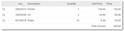
The calculation area is set in the column configuration of a view table.
Intrexx Share
Intrexx Share comments
This element can be assigned to an Intrexx Share Plugin and displays the comments for the current feed.Other controls
Tagging - Bookmarks
The Tagging – Bookmarks edit element allows bookmarks to be set for any kind of entry. An evaluation and comment for the entry is also possible.View tagging - Bookmarks
This view element will show the tags that you or other users have entered using the Tagging – Bookmarks edit element.Web service view table
The Web service view table can, as with the view element Duplicating group, be implemented to list data records that are retrieved from a web service.Duplicating group
A request with multiple values can be transmitted to various web services simultaneously. The view element Duplicating group offers an easy possibility here to enter a variable amount of input values. The element can be used like a normal grouping to group edit elements. Edit elements that are placed in a grouping have no link to a data field. If you move an edit element to a repeating grouping, any link to data fields will be removed, if one exists.Sortable grouping
Elements, which are grouped with sortable grouping, can be moved up/down or right/left, using drag and drop within the sortable grouping. Additionally, an icon in the right hand area of the title bar enables individual sortable elements to be hidden from display in the browser when the information they contain is not required. | Sortable grouping vertical |
 | Sortable grouping horizontal |
Thus, for example, an application may have an extensive range of filters setup. Users, who only want to use a selection of the available filters, can use these controls to hide individual elements from their displays, and thereby create a customized workspace for themselves.
If any element, for example, a view field or a check box, is placed in a sortable grouping, a Sortable element will be created automatically. This is a further grouping, within which the elements can be summarized.
Here, you can see two sortable elements within a sortable grouping. In the browser, these sortable elements, together with the elements contained, can be moved horizontally or vertically – depending on the type of sortable grouping - within the sortable grouping
In the properties dialog of the element, the title of the sortable grouping can be edited.
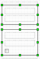
Grid
The grid can be used to develop a page layout that is freely collapsible based on the Foundation Framework. This adjusts itself to the diverse screen sizes of desktops, tablets and smartphones. General information regarding Responsive Layout can be found here.This element can only be used on pages that do not use a table layout. The setting Use table layout can be found in the pages' properties. The properties dialog can be reached by double-clicking on the page in the Application structure. When you place the element onto the workspace, it adjusts itself automatically to the width of the workspace.
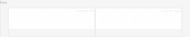
A grid can contain a maximum of twelve columns in which you can arrange the application elements that you would like. The number and width of the columns can be specified in the grid's properties dialog. You can reach the properties dialog by double-clicking on the frame that surrounds the grid element. If you click directly on one of the rows, the ZOOM workspace area will open, this depicts the content of the current column. In this way, even layouts that are more complicated can be edited effectively because you have access to a single workspace per column in the ZOOM area.
Functions for the elements: Sortable list, File selection, View field with control type: Image-URL
| Sortable List | Image selection | Image URL | |||
| Edit | View | Edit | View | ||
| Show Link to image in original size | - | - | + | + | + |
| Apply correct orientation to rotated images in original size | - | - | + | + | - |
| Apply correct orientation to rotated images | + | + | + | + | - |
| Maximum size (Width / Height) | + | + | + | + | + |
| Crop image | + | + | + | + | - |
| Optimize file size for thumbnails (reduce) | + | + | + | + | - |
| Adjust control size to maximum size | - | - | - | + | + |