Areas of the Applications module
Application structure- Application node
- Data groups
- System data groups
- External data groups
- Data fields
- View pages
- Edit pages
- Pages in the application menu
- Start page
- Portal pages
- Office integration
Favorites
Workspace
Search, Notifications, Problems, Description, Script
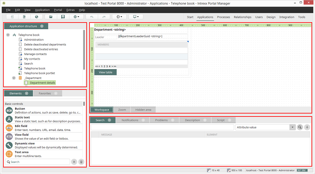
A new or existing application will be loaded in the Applications module. The module is subdivided into five areas. The sizes of these areas can be changed by dragging with the mouse. To do so, position the mouse cursor on the border of an area until the cursor symbol is shown as a double arrow. If there is insufficient space for elements to be displayed in an area, vertical and/or horizontal scroll bars will be shown automatically.
Every tab, with the exception of the workspace, in the module can be closed via the
 symbol next to the title. If you show a tab via the menu View,
and it is shown in its own window, you can also anchor it in one of the
areas to the left or the right of the workspace, by dragging its title
with the mouse to the desired position.
symbol next to the title. If you show a tab via the menu View,
and it is shown in its own window, you can also anchor it in one of the
areas to the left or the right of the workspace, by dragging its title
with the mouse to the desired position.
While the window is being moved, the area will be shaded in gray in its future position as a preview, and then anchored at the moment in which you release the mouse button. Areas can also be made into their own window.
From the main menu View, areas can be hidden and then shown again. Furthermore, the default view can be restored.
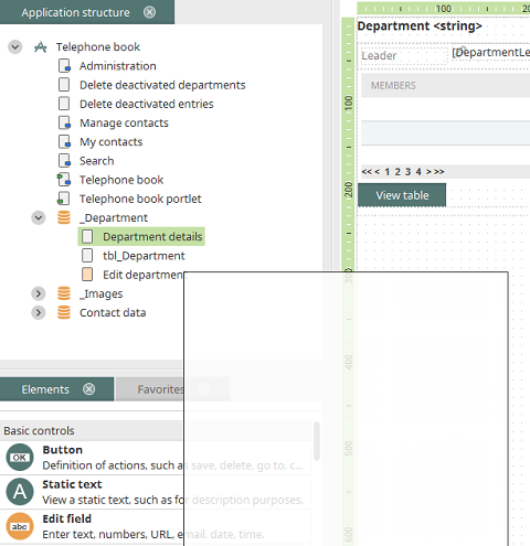
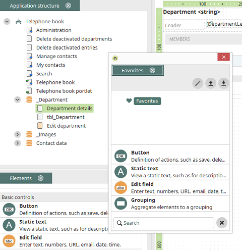
Application structure
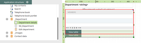
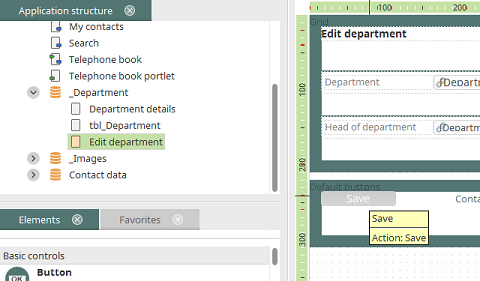
In the upper left area of the Applications module, the hierarchy of the individual pages and data groups of an application will be displayed.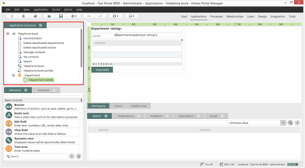
Clicking on the
 arrow symbols left of an element's name allows
subordinate levels of the application structure to be opened or closed.
arrow symbols left of an element's name allows
subordinate levels of the application structure to be opened or closed. Application node
The application node can always be found at the uppermost
place in the application structure. It represents the application
itself. In the properties dialog, general properties of the
application, the application menu, portlets, and access permissions
will be defined. From the context menu of the application node, new
data groups, foreign data groups, system data groups, view pages, and
portal pages can be created.
 Data groups
Data groups represent database tables. With the context menu
item New, edit pages, view pages, view pages with
elements, portal pages, subordinate data groups, data fields, and
references can be created. The Delete context
menu allows a complete data group, including all pages, data fields,
and references contained within it to be deleted. The data of the data
group will thereby be irretrievably lost. The context menu item Show
/ Hide data fields allows the data fields of the data group
in the application structure to be shown or hidden. The Properties
context menu item opens the properties dialog for the data
group. The Details context menu item is only
visible when options for experts is activated (Menu item Extras
/ Options), and will give you the GUID, Title,
Type, and Name of a highlighted
element.
System data groups
Only one data set may be saved in a system data group. The system data group
is therefore well suited for saving application-wide constants, such as
a fixed investment amount after which an approval is required, or the
activation of an audit trail for the releasing of documents or the saving
of email address that are used in the application. One only system data group
can be saved in each application; this is created from the
application node. The data in
a system data group has validity application-wide. They can be used in
all data groups of the application. The values of a system data group are
saved in the database table LCAPPPROPS under
the application GUID. With an edit page integrated in the application menu,
the system data group's data can be edited very easily.
 |
The values in the database table LCAPPPROPS may not be modified. United Planet assumes no responsibility for erroneous changes, e.g. those performed by a process that writes to the table. |
 External data groups
With an external data group, data will be connected from
external sources.
 Data fields
The data fields of a data group can be shown in the
application structure by clicking on the context menu item Show
data fields.
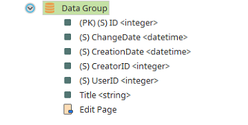
Here you will also find the following system data fields:
(PK) (S) ID
ID of the data set(S) UserID
ID of the user who last edited the data set(S) ChangeDate
Date of last change(S) CreatorID
ID of the user who created the data set(S) CreationDate
Date of creation
Data types
The Elements used in the application development can be linked to data fields. Data entered in the edit elements can be saved in the connected data fields. View elements can display the values saved in the data fields. Intrexx uses the following data types for data fields:-
String
Short text -
Text
Long text -
Integer
Integers -
Double
Decimal numbers -
Datetime
Date and time -
Boolean
Boolean values such as true and false. -
File
Referral to files
 View pages
This symbol designates view pages, on which data entered
to an application will be shown.
 Edit pages
This designates edit pages. Edit pages are always found
within a data group. New edit pages may be entered via the context menu
of their data group.
 Pages in the application menu
This symbol designates view or edit pages that are
connected to the application menu. These pages can be directly accessed
in the browser from the application menu. The application menu can be
changed in the properties dialog of the application node.
 Start page
This symbol designates a main or edit page that has
been defined as the start page of the application. The start page will
be loaded first upon clicking on the application link in the browser,
independent of what position it takes in the application menu or
whether it is there at all. Edit pages can therefore only be defined as
the start page if they are located in data groups directly below the
application node.
Portal pages
The portal page is a special view page that allows an
application portal to be constructed on it.
 Office integration
Edit pages with Office integration will be designated
with this symbol.
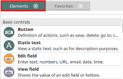
Elements
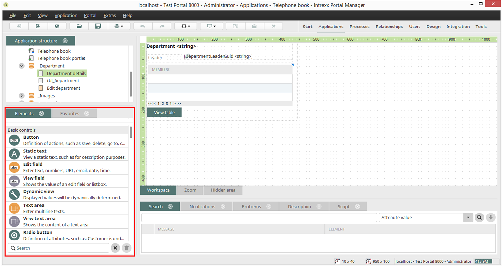
All information on this topic can be found here.
Favorites
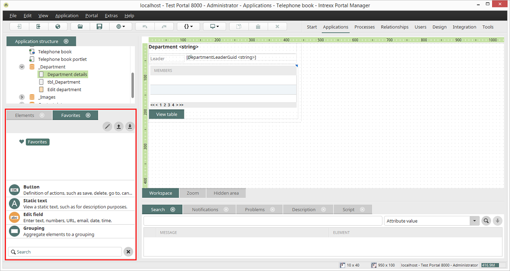
Frequently used items can be included in this area for quick and easy access.
 Configure favorites
Opens a dialog where elements can be added to the favorites list.
 Export favorites
Exports the favorite list as an XML file.
 Import favorites
Imports an exported favorite list.
Workspace
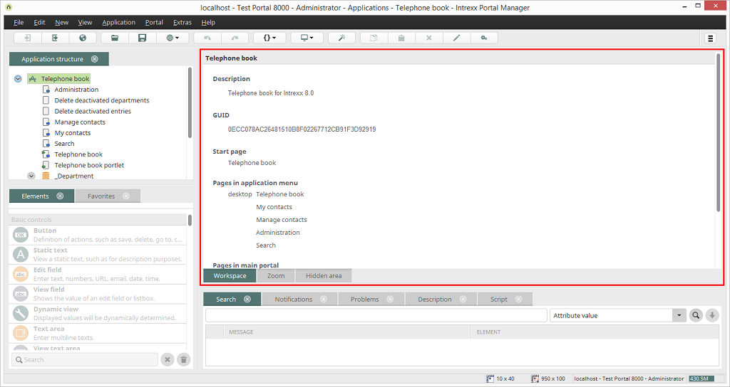
In the right-hand area of the Applications module you will see the workspace. The contents and appearance of the workspace will change, depending on whether a page, data group, or the application node is selected in the application structure. If, for example, the application node has been highlighted, the workspace will inform you of the application description, start page, and additional pages of the application.
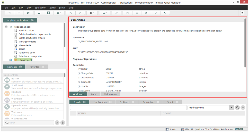
If a data group has been highlighted, the name of the corresponding database table will be shown. All data fields and references of the data group will be listed.
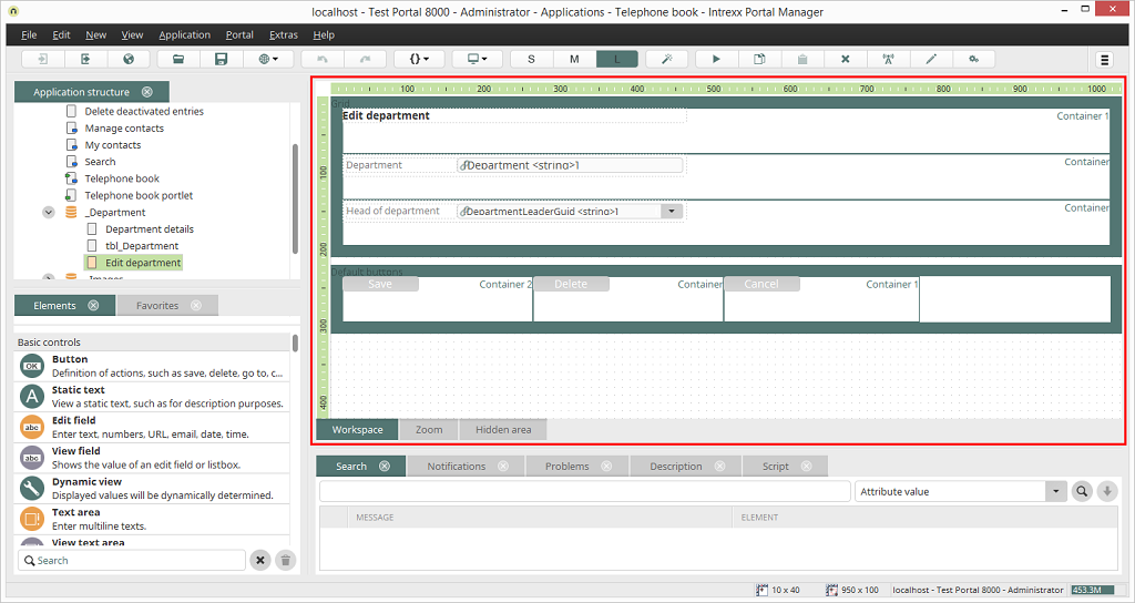
If an application page in the application structure has been selected, elements can be assigned via drag & drop to the workspace.
If an element in the workspace is moved with the mouse to a position that is not allowed, such as when elements overlap one another or when the borders of the workspace have been exceeded, the border of the element will be shown in red.
The most important properties of the elements will be displayed in a quicktip when the mouse is positioned over an element.
Script
Elements with script calls or comments will be automatically designated with a blue symbol. Edit elements for which an
entry is required (mandatory field) will be designated on the workspace
with a red
symbol. Edit elements for which an
entry is required (mandatory field) will be designated on the workspace
with a red  symbol.
Help lines
On the workspace, vertical and horizontal help lines can be inserted via the context menu.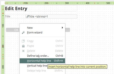
These help lines will be displayed in every application that is loaded in this way. They serve to help orient the designer on all pages to create a uniform layout. In the browser, these lines will not be visible. The workspace will then be given a grid on which view and edit elements can be aligned. Additionally, a ruler will help you to position the elements. The current coordinates of the mouse pointer will be shown highlighted on the ruler. You can select elements in the workspace by clicking on them. You can select multiple elements by clicking with the mouse and dragging a border around the elements, or by clicking on the elements, one after another, while holding down the Ctrl key.
Group
With the context menu item Group, selected elements can be grouped together.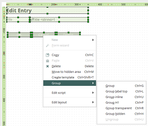
-
Group
The group uses a background shading. -
Group label top
The grouping is created with the HTML element div and the page, where the grouping is made, is transformed to a layout without tables. Titles in the controls are hidden and title fields are shown above the controls. -
Group inline
All elements are transformed as inline elements. Depending on the elemt type, display:inline; or display:inline-block will be written in the CSS. -
Group H1
The text of the grouped elements are automatically assigneed the style class H1. -
Group transparent
Groups the elements without background shading. -
Group hidden
Groups the elements and hides them. -
Ungroup
Removes the grouping.
Zoom
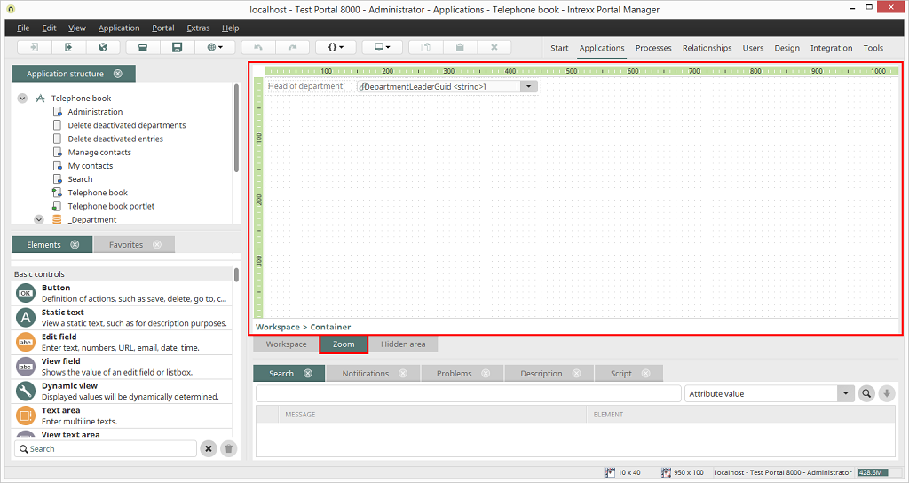
You'll find the tab Zoom underneath the workspace. If the Grid element is located on a page without a table layout, the individual columns of the rows can be edited in the Zoom area.
Hidden area
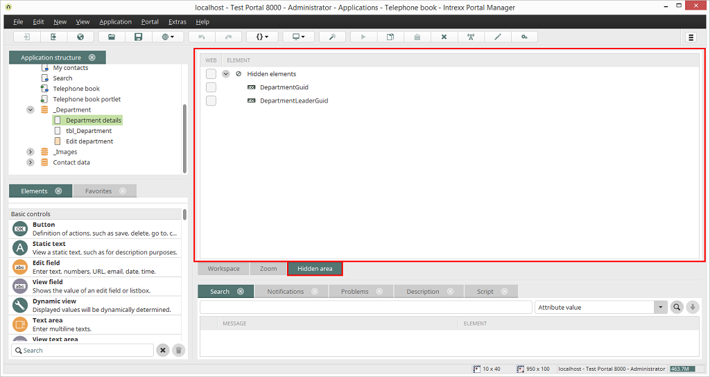
In addition to the workspace, there is also a hidden area, which – like the workspace – can be populated with elements. The elements defined here are not displayed on the screen. Using the additional control Settings, which you can find in the Design module, or with the keyboard shortcut Alt + h, the hidden elements can be displayed if necessary, for example, for testing purposes. The keyboard shortcut can be configured in the internal/system/xml/misc/shortcuts.xml file. Elements can also be moved via drag & drop to the hidden area and then configured just like visible elements. If elements are to be used in JavaScript, that is, to be available in the browser, you need to activate this setting in the Web column. If the setting is not activated for a particular element, then that element can only be used server-side, (e.g. in Velocity).
Hidden grouping
All hidden elements will be combined in a group. You can open the properties dialog of the hidden group by double-clicking on the Hidden elements entry. Other groups can be created within the highest level grouping in the hidden area, e.g. to group the hidden elements into smaller units for clarity.Search, Notifications, Problems, Description, Script
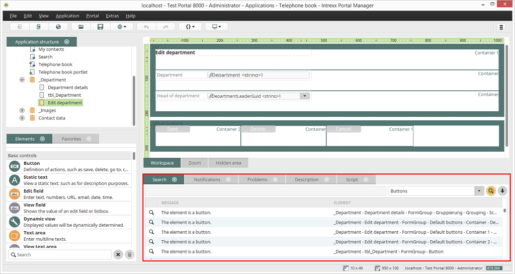
In the lower area you will find several tabs, which can also be shown or hidden via the View main menu item. Here you can search through the currently opened application by specific criteria here. This function can be very helpful during the development process and when maintaining an application. Whenever you double-click on an entry in one of these tabs, the corresponding element will be highlighted on the workspace.
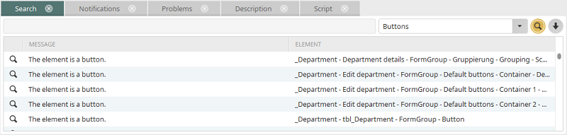
Search
In the list box several functions for the search are available. The search string can be entered in the search field on the left hand. Click on
 Search to start the search.
-
Attribute value
This function gives you the ability to make a targeted search for an attribute value. In the expert mode, the expert attributes of elements will be assigned values. Here all elements will be listed that possess an expert attribute with the value that you enter in the search field. -
Data fields without edit control
You can search through the application for Data fields without edit element in order to list all data fields that are not connected to an edit element. -
Buttons / Buttons sending an email
The search can be run for buttons and buttons that execute a send email action. -
Elements linking to other applications
The search for Elements linking to other applications returns all elements that are connected to other applications, such as buttons whose target page is found in another application, or tables that show data from other applications. -
Elements linking to relationships
The search for Elements linking to Relationships returns all elements that are connected to relationships. -
Elements using JavaScript
When searching for Elements using JavaScript, all elements will be listed that have a script call entered in their events. -
Elements using style class
Elements using style class will find elements that have been assigned a specific style, which you can enter to the search field. -
Elements with comments
If you search for Elements with comments, all elements will be listed that have been assigned comments, as long as you enter no text to the search field. If text has been entered to the search field, the search engine will look for elements that contain this text in their comments. -
Elements without title
Searching for Elements without title will find all elements that have no title entered for any of the portal languages. -
Groovy
The search for Groovy returns all elements that are using Groovy script. -
GUID: Definition
This function will find the element with the GUID you entered in the search field. -
Velocity
Searching for Velocity finds all VTL-Include view elements integrated into the application.
Notifications
On this tab messages will be printed, for example if an element cannot be deleted because it is linked with other elements.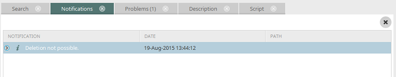
Problems
Here errors in the application or FIXME- or TODO comments in scripts will be listed.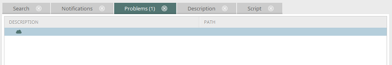
Description
Here you also have the ability to enter a description of the currently selected element.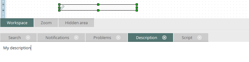
This applies for all elements of an application, i.e. pages, data groups, data fields, etc. The text that you enter here will be entered in only one language when the application is saved.
Elements with a description will also be designated with a
symbol on the workspace.
 |
If entering a description is not possible, such as when multiple elements are currently selected, this symbol will appear in the comments field. |
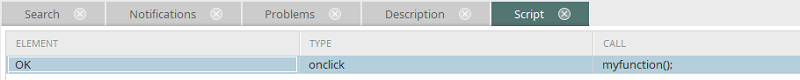
Script
Under the tab Script, an overview of all script calls used on the page is provided. By double-clicking on an entry, the element, to which the script call is assigned, will be highlighted in the workspace.