Grid properties - Column configuration tab
Applications module Grid Properties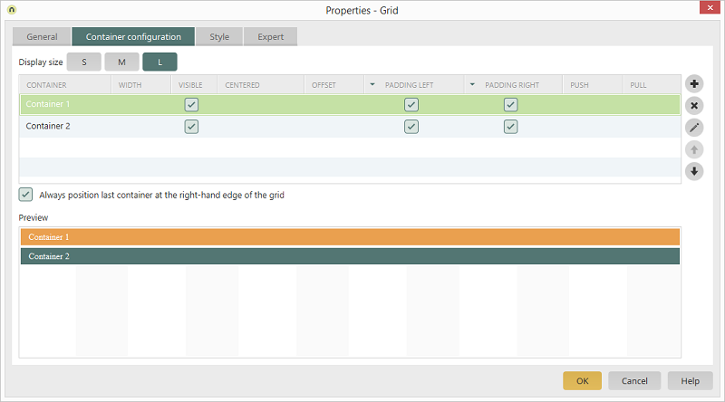
 |
The following settings are ignored if the setting Same container height is activated on the General tab:
|
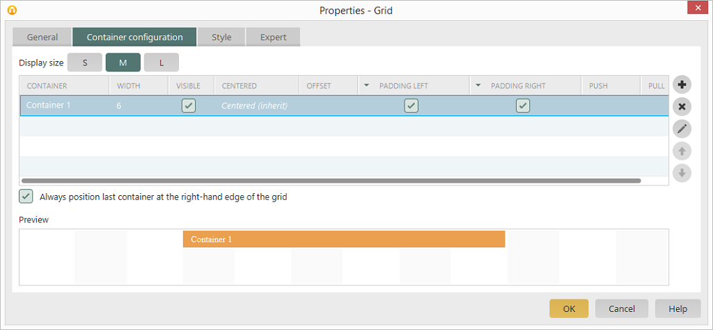
Display size
Here, you can edit the grid's columns for each display size (SMALL, MEDIUM, LARGE). |
We recommend that you start with the layout for the display setting SMALL. Naturally, the displays on smaller devices such as smartphones will present the greatest challenge to the depiction of content. Once all of the columns have been setup up for the smallest display size, the presentation on larger devices can be developed very quickly and simply. |
Container
By double-clicking on the name of a container, a dialog will open that allows you to modify the container name.Width
Click in this column to select the desired value from a list. Further information about this setting can be found here. |
If a container's content is provided with a specific width which is wider than the container itself, then this content will exceed the container's border. This overflowing content will be overlapped by the subsequent container. The responsive behavior of the container will not be affected. If you forgo using elements, then exceeding the container borders can be avoided. An individual style can be assigned to the affected responsive container or a grouping within a responsive container in order to control the overflow behavior. The overflowing area can be hidden using the CSS property overflow-x: hidden or horizontal scroll bars can be shown using the CSS property overflow-x:scroll. |
Visible
With this setting, the corresponding column is visible in the grid. Less important content can be hidden on smaller devices. The subsequent containers close ranks so that there are not any gaps. Please note that hidden containers are still present on the device. This means that the same amount of data is transferred.Centred
With this setting, all containers, which are positioned in from of the centred container in the grid, maintain their position. The remaining space in the row is reserved for the centred container. The centred container is not positioned in the middle of the reserved space but rather in the horizontal middle of the entire grid. If the previous containers already take up half (or more) of the space then the centred container will be overlapped.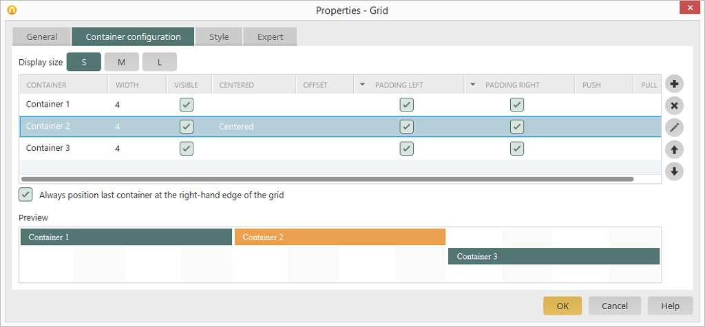
Of other containers follow the centred container, these will be moved to the next row and placed at grid position 1. The same rule applies here as well that the last container in a row is positioned at the right-hand edge. This can be pulled across to the other containers by deactivating the Always position last container at the right-hand edge option.
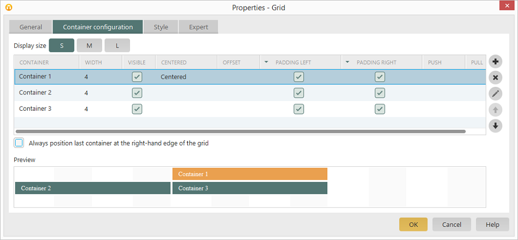
It is generally recommened to only select the Centred option for a container if this is by itself in the grid but does not take up the entire 12 grid units.
Offset
These settings enable you to shift a container to the right by a defined number of grid units. The containers that follow afterwards will also be shifted.Left padding, Right padding
If this option is not selected, the container will be displayed without left or right padding, respectivelyPush / Pull
These settings enable you to shift a container to the right or left, respectively, by a defined number of grid units. As opposed to the Offset setting, the containers that follow will not be shifted. The Push and Pull settings are usually only used for swapping containers of the same size. To do this, one container is given the Push property (shift to the right) and the second container is given the Pull property (shift to the left). Please note that containers can overlap if incorrecet values for Push and/or Pull are entered; this usually needs to undesirable results.Always position last container at the right-hand edge
if this setting is not activated, the last container will be positioned directly next to the container before.Preview
On the right-hand side of the dialog, you can see a schematic preview of the current column configuration.Buttons in the dialog
 Add column
A new column is created.
 Delete column
Removes the selected column from the list
 Edit column
Opens a dialog that allows you to edit the column's title.
 Change order
Shifts the selected column up or down, respectively.
|
If a column is deleted, the elements contained within will also be deleted. A corresponding notification will also be shown before deletion. |