Gallery type A properties - Options tab
Applications module Gallery type A Properties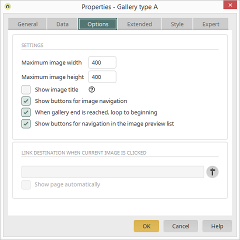
Settings
Maximum image width/height
The maximum width and height can be defined in pixels here.Show image title
With this setting, the image title is shown beneath the currently selected image. You can discover how to use an image title from a data field here.Show buttons for image navigation
Buttons will be shown on the right and left in the image. These are used to move forwards and backwards through the gallery.When gallery end is reached, loop to beginning
Shows a button that links to the first image in the gallery when the user reaches the last image. If this setting is not activated, the user can only scroll backwards through the gallery when they reach the end of the gallery.Show buttons for navigation in the image preview list
Buttons will be shown on the right and left in the image preview list. These are used to move forwards and backwards through the gallery.Link destination when current image is clicked
The page, with the corresponding application and data group, that is loaded when a user clicks on an image in the browser is shown here. Select and position page
Opens a dialog where the target page, which will open when a user clicks on an image in the browser, can be defined
Show page automatically
The target page is loaded automatically when the gallery is started.Image title from data field
To use a data field that contains the image title in the gallery, switch to the view page which is used as the page for the preview image on the Data tab in the gallery properties. Open the properties of the View file selection element there.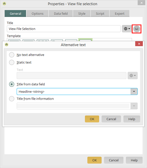
Click on
 Edit alternative text
to open a dialog where the Text from data field
option can be selected. Select the data field that contains the image titles.
Edit alternative text
to open a dialog where the Text from data field
option can be selected. Select the data field that contains the image titles.