Button properties - Action type
Applications module Button Properties / Actions tabYou can find information regarding the link destinations and destination options here.
1. No action
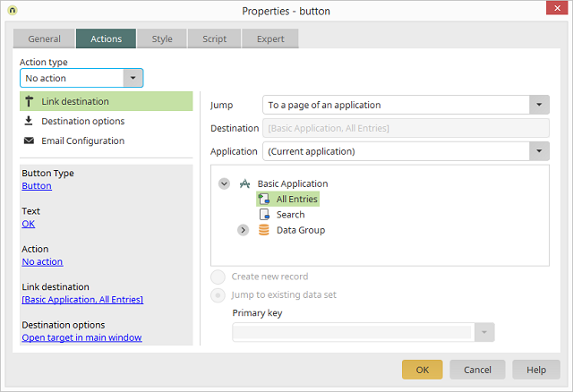
If you only wish to load a different page, select No action.
2. Save

This action is available for use on all edit pages. Clicking the button will save the current data record. If a user possesses no permissions to save, change, or delete data in the affected data group, the button will be hidden in the browser.
3. Delete
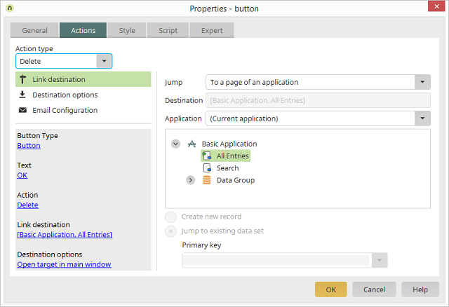
On a page within a data group, the current data record and all dependent data records in subordinate data groups will be deleted with this action.
4. Data navigation
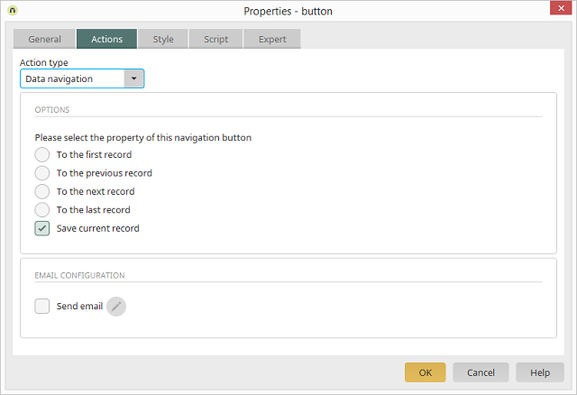
With this action type, the button can be used to page through data records.
4.1. Options
- To the first record
- To the previous record
- To the next record
- To the last record
Save current data record
With this option, the data record will be saved when the user navigates to another.4.2 Email configuration
4.2.1 Send email
All information regarding this topic can be found here.5. Data Picker
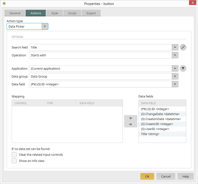
This action type uses a search term from an edit field defined here and populates the mapped fields with the found data from the same data record. If, for example, the name of an employee is entered into an edit field, which has been defined as the search field for the Data Picker, the Data Picker searches, when it is clicked on, for the email address and telephone number of the employee and enters these automatically into the assigned edit fields.
5.1 Search field
Select the edit field that should be used as the seach field. Advanced
Opens a dialog where the appearance of the table, where the search results are listed, can be modified.
5.2. Operation
The type of comparison can be determined here:-
Contains
Returns results if the search term is contained in the data field value. -
Starts with
Returns results if the search term corresponds to the first characters of the data field value. -
Ends with
Returns results if the search term corresponds to the last characters of the data field value. -
Equals
Returns results if the search term corresponds to the data field value.
5.3 Application, Data group, Data field
Here, select the data that should be searched through. Filter
Opens a dialog where a filter for restricting the data can be defined.
5.4 Mapping
In this list, you can see every element that can be populated by the Data Picker.5.5 Data fields
Mapping list
All of the elements on the current page which are available for the Data Picker are listed here.Data fields list
All of the available data fields from the current application and data group are listed here.
 Maps the selected elements to one another or removes the mapping, respectively.
An assignment can only be made if the data type of the elements and
data fields match.
Maps the selected elements to one another or removes the mapping, respectively.
An assignment can only be made if the data type of the elements and
data fields match.
5.6. If no data set can be found
Clear the related input controls
The search field will be cleared if the search was unsuccessful.Show an info view
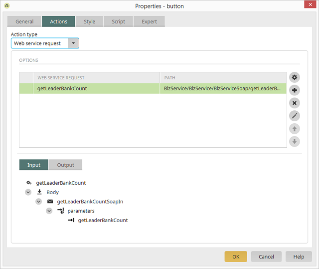
With this setting, a notification will appear if the search was unsuccessful.6. Web service request
General information about this topic can be found here.
6.1 Options
Here, every web service and the corresponding Path will be listed. If web services are requested here that are provided in other Intrexx portals, a login is required,- if the addressed portal is configured with an Intrexx authentication. The request intrexxLogin is used for this.
- wif the addressed portal is configured with an integrated Windows authentication. The request Login must be used for this.
 Configure web service
 Starts the registration process of a web service from the Applications module
 Add web service call
Opens a dialog where an operation can be selected.
 Delete web service request
 Deletes an entered request.
Edit Opens an additional dialog, where the construction of the web service is represented.
 Increase / Decrease priority
The arrow buttons allow the priority to be changed when multiple requests are defined. Multiple web services will be executed one after another in sequence. The uppermost call will be started first; afterwards, all requests below it will follow in order.
6.2 Input tab
Here, the structure of the operation from the request web service is depicted. Select the method that should be provided with a value from the application. By right-clicking, you can open the Edit context menu where the source of the value can be defined. The data type that the web service expects is shown in brackets next to the method (e.g. blz (string)).6.3 Output tab
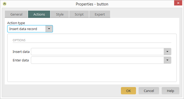
Here, the value received from the web service can be assigned to an application element.7. Insert data record
With this action, new entries can be added to drop-down lists from the browser. The new entries will be simultaneously saved to the data group connected to the drop-down list. Data groups that exist in parent-child relationships to one another cannot be used in this way. Clicking on the button in the browser opens a popup window where the new entry for the drop-down list can be recorded.
7.1 Insert data
This option allows you to choose the drop-down list which the new entry should be added to.7.2 Enter data
This option allows you to choose the page where the new entry will be entered.8. Calendar
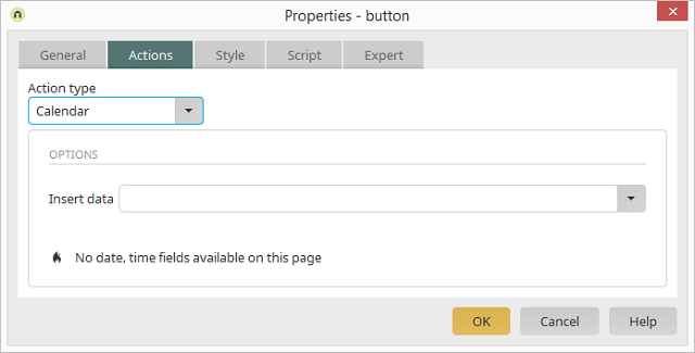
This action type creates a button, which will show a small calendar in the browser when it is clicked, which allows a date to be comfortably selected. The date will be then automatically entered to the connected edit field.
8.1 Insert data
Select the edit field that the date should be entered into here.9. Show/Hide
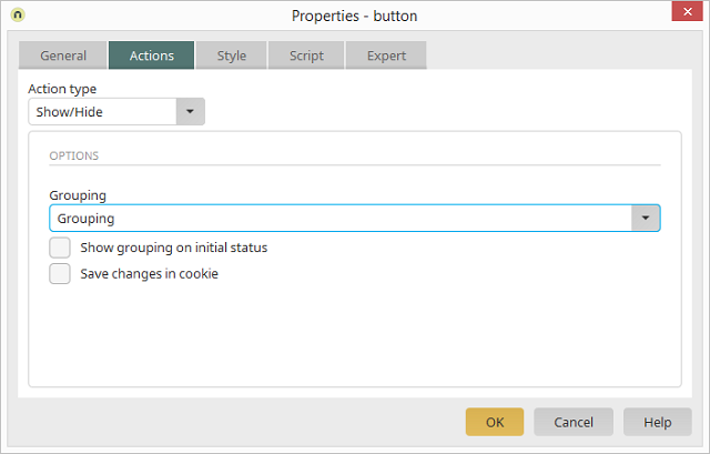
This action will show or hide grouped elements in the browser.
9.1 Grouping
Select the group to be shown or hidden in the Grouping list.9.2 Show grouping on initial status
This setting will show the group when the page is loaded.9.3 Save changes in cookie
Selecting this option will return the user to the last status (group shown or hidden) when the page is reloaded in the browser.10. Show/Hide flexible
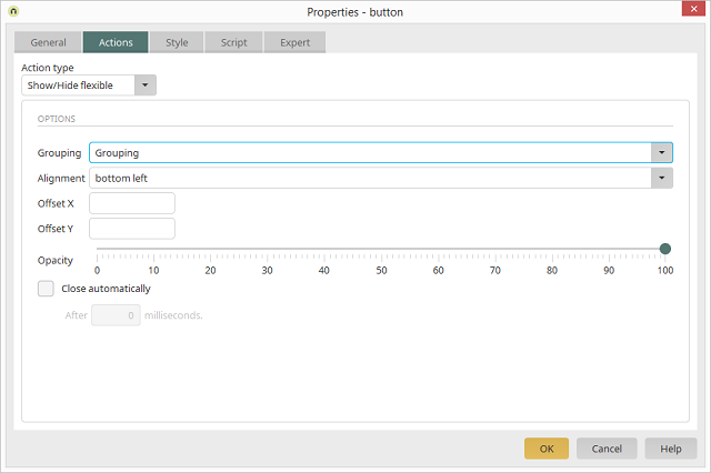
As opposed to the Show/Hide action, the grouped elements will be shown here in the form of a tooltip.
10.1 Grouping
Select the group to be shown or hidden in the Grouping list.10.2 Alignment
Select the grouping's positioning relative to the button.10.3 Offest X / Offset Y
Values in the fields Offset X and Offset Y define the horizontal and vertical position of the tooltip. The values entered correspond to the distance of the popup window to the button in pixels.10.4 Opacity
With the Opacity slide, the level of transparency will be set. A transparency of less than 100 percent will make page elements under the popup visible. Please note that the tooltip will always appear transparently if a background color is not defined (Style tab in the properties dialog of the grouping).10.5 Close automatically
This checkbox will close the popup window after the time that has been entered under After ... milliseconds has passed.11. Duplicate group
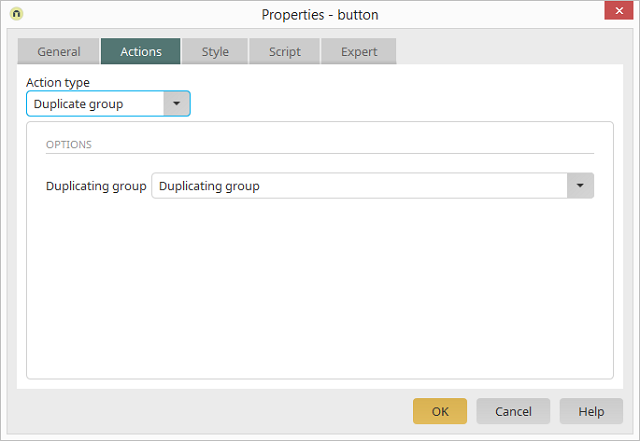
This action is available if a Duplicating group can be found on the page.
11.1 Grouping
Select the group to be shown or hidden in the Grouping list.12. Delete group
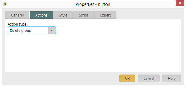
If the duplicating group is used for the input of values for a web service request, an additional button can be inserted to delete redundant groups in the duplicating group. With the action type Delete group, the corresponding group can be deleted by clicking on this button. Values that were entered to this group will then not be sent in a web service request.
13. Search

The Search button action is used in connection with the Search view element. You can find all information here.
14. Create document
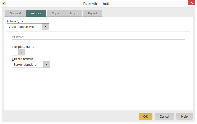
All information regarding this topic can be found here.
15. Previous / Next
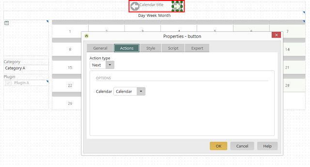
These two button actions are used in combination with the elements Calendar and Resource. With these, the user can navigate forwards and backwards through the calendar or resource element, respectively.
15.1. Options
15.1.1. Calendar
Here, select the calendar, or resource element, that should be controlled with the Previous or Next action.16. Delete folder
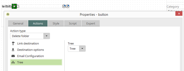
This action is used in combination with the elements Tree and Tree view for the Delete folder button. This button can be generated in the Final settings dialog while creating a Tree element. Clicking on this button in the browser deletes the currently selected folder in the tree.