Grid properties - General tab
Applications module Grid Properties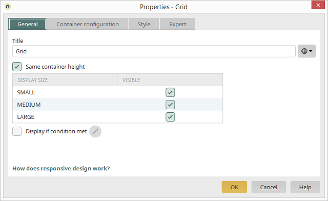
General
Information about responsive design can be found here.Title
Provide the Grid element with a Title here.Same container height
If this setting is active, all columns will be displayed with the same height. The height is determined by the highest column in the grid. |
The following settings are ignored if the setting Same container height is activated on the General tab:
|
Display size
In the Design, the minimum display width for the sizes MEDIUM and LARGE can be specified in the Layout properties, which can be opened via the menu Layout / Layout Settings / Responsive.Visible column
With this setting, the entire grid can, if required, be hidden for each of the display sizes. Please note that hidden grids are still present on each device. This means that the volume of data isn't reduced.Display if condition met
Activates the Conditional display of the grid. Edit condition
 This button opens the Script Editor where the condition can be formulated.