 Application Node
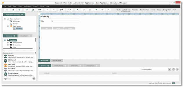
 symbol next to the title. If you show a tab via the menu View,
and it is shown in its own window, you can also anchor it in one of the
areas to the left or the right of the workspace, by dragging its title
with the mouse to the desired position.
symbol next to the title. If you show a tab via the menu View,
and it is shown in its own window, you can also anchor it in one of the
areas to the left or the right of the workspace, by dragging its title
with the mouse to the desired position.
 Application Node
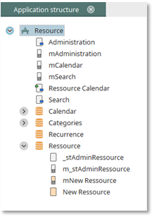
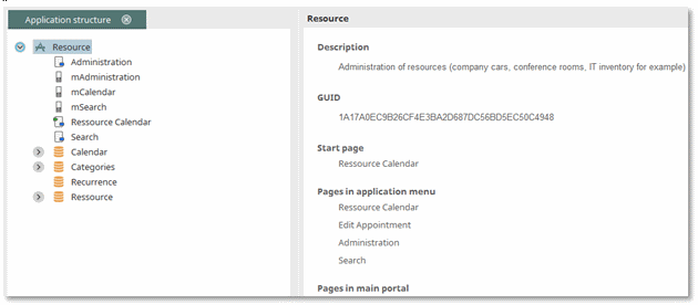
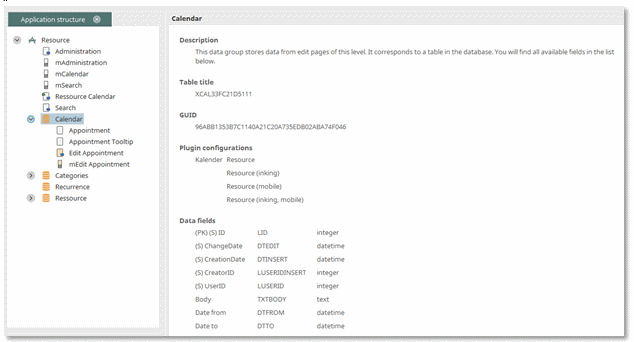
 Data Groups System Data Groups
 Foreign Data Groups
 Data Fields
 View Pages
 Edit Pages
 Pages in the Application Menu
 Start Page Portal Pages
 Keyhole Pages
 Office Integration
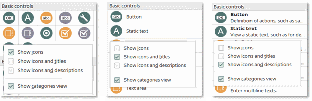
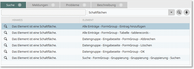
 Configure Favorites.
 Export Favorites. An existing Favorites export file can be imported again by
clicking on
Export Favorites. An existing Favorites export file can be imported again by
clicking on  Import Favorites.
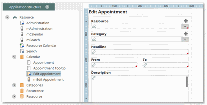
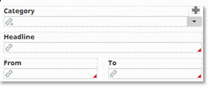
 symbol. Edit elements for which an
entry is required (mandatory field) will be designated on the workspace
with a red
symbol. Edit elements for which an
entry is required (mandatory field) will be designated on the workspace
with a red  symbol.
 symbol on the workspace.
 |
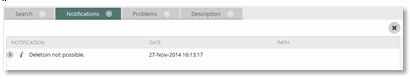
If entering a description is not possible, such as when multiple elements are currently selected, this symbol will appear in the comments field. |